August 27, 2014
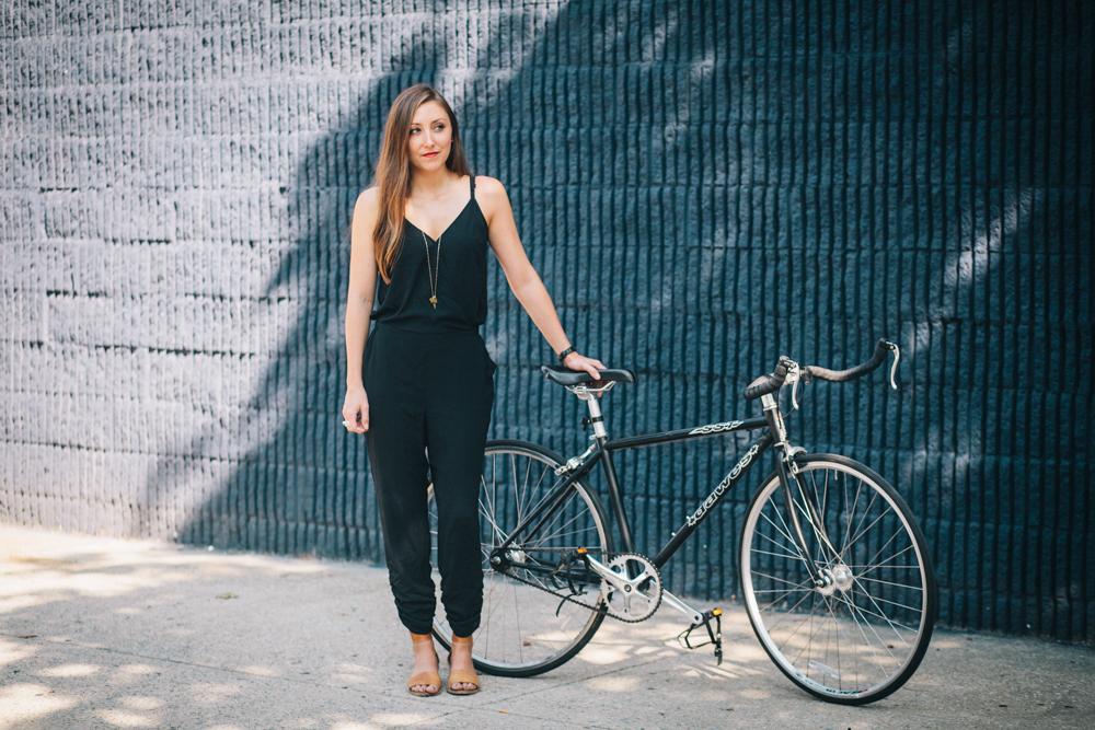
Bike New Yorker #11: Deva Pardue

Noticed anything different about us lately? A new font here, a new color there… perhaps even a new logo? Well, you ain’t seen nuthin’ yet ! In a couple months, you’ll be seeing some even bigger changes, primarily in the form of a brand-spankin’-new website. For this month’s Bike New Yorker interview, we checked in with Deva Pardue of Emily Oberman’s team at Pentagram, the revered design and branding firm responsible for spiffing up our image, to talk about choosing colors, the challenges of building complicated websites, and, of course, whether or not she plans to ride next year’s Tour.
What is your main passion as far as design goes?
I love print. I never imagined that I’d be doing as much web as I am, but that’s just the way it’s going. I’m really enjoying it. I mean, I’m glad I don’t have to code websites, but it’s nice designing them. You have to think in a different space, but ultimately it’s similar to print—the same principles apply.
What has it been like working with Bike New York on this rebranding?
I’m totally excited about it. It’s definitely one of the best client experiences I’ve had so far. One of the things that I love most about being a designer is that you get to peek into these worlds that you wouldn’t normally be exposed to otherwise. With Bike New York, I’m learning more about biking than I knew before. Riding in the TD Five Boro Bike Tour was something that I had always been interested in, but I don’t know if I necessarily would have done it if I wasn’t working with you guys. That was great. Like, I didn’t realize how close it was for me to ride to PS1 in Queens. You do the Tour and you’re like, “Wow, I could do that so easily,” and I went to a Warm Up party a few weeks later. It’s nice to take a deep dive into something I’m already interested in.
Was riding this year’s Tour helpful from a design perspective?
Absolutely. It was the perfect time for me to do it, because now, for next year, I’ll have seen it for myself and I’ll know what works and what doesn’t. It’s like if you were to design the cover for a book, ideally you’d want to read the whole book so that you could really understand it.
I’d like to talk a little bit about the rebranding. Let’s start with the color. “Bike Lane Green,” I think it’s called.
We do a lot of research in the beginning. We did a lot of mood boards and image searching, to figure out “what is biking in New York?” It just came up. It’s there. It’s everywhere. The grey of the pavement, the green of the lanes…
Do different colors have different emotional associations?
Color is such a weird thing. Everyone has their own associations and their own opinions about it. Some designers would say it’s arbitrary. A lot of people do things on black and white first and then pick the color, because it needs to work in black and white. If you have a room full of clients, someone will like the color and someone won’t. But sometimes it’s the easiest part of the job, and this is one of those cases where it was very obvious what it should be. It was a clear decision.


I started working at Bike New York after the new logo was chosen, but I did take a peek at the different versions that were submitted for consideration, and I love the one we went with. How do you feel about it?
Well, I feel great about it, because it was the one I worked on! [Laughs] Well, it was Emily [Oberman]’s idea; she had sketched it early on and we weren’ t sure if we could make it work… It seemed like it should be able to work, but it took some playing with, so it was redrawn a few times before we got it right. There’s a bike and there’s an “NY,” so it just came together, like the colors.
It’s tough, because in the bike industry, when it comes to logos, people will make anything they can out of a bike. So I was actually surprised that I did like it, because it was like, “Here we go again, another bike…”
I think we felt the same way. We didn’t want to do this unless we could do it well, because it was something that had been attempted other times. But I think we got it right.

Then there’s the font, which I love, too, but I don’t really know why.
It’s serious, it’s strong and it’s bold—but it’s friendly and approachable. It’s round and geometric. It just sort of feels right.
You’ve been hard at work on our new website, which is slated to launch in a couple months. What’s that been like for you?
It’s a very content-heavy website and there are so many different parts, so it’s been a challenge to really think through that. I’m really excited about the “Advice” section. People can go to the website and sign up for classes, but they can also go there and learn stuff outside of a class, and I think that this can be a really exciting, dynamic part of the website that wasn’t utilized like that before. And now with you there, it’s going to have better imagery, too—I think that’s going to be an awesome part of it. It’s been one of the most fun pages to design.
I’m glad you’re having fun with it. Are you going to ride the Tour next year?
Yes!
No hesitation there.
I’m going to have my Mom do it with me this time.

